Our guidelines outline how we have evolved our system to be flexible and stay relevant for our businesses, functions and geographies, beyond corporate needs.
Brand Guidelines

Introduction to the Dow Brand
Our brand strategy
The most important and distinctive element of our visual identity is the DOW Diamond logo. The Diamond represents our brand strategy; using it consistently builds equity and brand recognition.
Our DOW Diamond logo consists of three elements always used as a unit: the symbol, the logotype and the trademark. The symbol is the red Diamond, the logotype is our company name in white text and the trademark is the registered trademark symbol.
We have three logo color schemes to support a range of production needs:
Full-color Dow Red logo (always use whenever possible)
This logo is designed to work on most backgrounds. The Dow logotype MUST BE IN WHITE to ensure contrast and legibility.
One-color black logo
Use when the full-color logo isn’t applicable, such as for printing in grayscale. The Dow Red logo is always preferred, whenever possible.
One-color reverse logo
When the full-color logo doesn’t provide enough contrast and legibility, such as on a complicated background, use this logo. You may reverse the Dow logotype over a solid background color when printing limitations dictate, for example on a promotional items.
Any third party use of the DOW Diamond requires legal approval from the Dow trademark department.
Download the full logo use guidelines and the approved DOW Diamond logo package in the Resource section.
Seek Together – what it stands for
- These two simple words work in tandem; they have a conversation with each other. This mirrors our back-and-forth conversation with our customers, an idea that is further developed in the visual system.
- It is a call to action for all of us to think differently, to keep aiming for more. And it is a promise to our customers to keep working with them to find new solutions.
- This brand system was built to work across all our businesses and functions: we are looking for a better way to work through digitization; finding the best talent through Diversity & Inclusion; and searching for new solutions alongside our customers.
- It is about today and tomorrow; it’s about anyone working in any part of our business. We’ll find new solutions through collabortion and partnerships as we build the future of Dow.
View the brand guidelines (DOW brandline section) for more information on the correct use of our brandline.
Our brand voice
Introduction
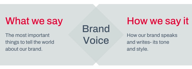
Everything we write and say on behalf of Dow becomes part of our brand voice.The brand voice guidelines break down how to apply strategy to what we say and how we say it; how to use our brandline, Seek Together™; and a new capitalization style for headlines and sub-heads.
Growing our voice over time.
Brand voice is a chance to show the world what Dow is all about. But it only works if we all use it – so embrace it, talk about it, make time for it. Over time, writing in brand voice will become an easy and natural part of writing for Dow.

We’re always:
Committed
We are dedicated to our audience and our subject. We are passionate about throwing a spotlight on what interests us so that others can discover it too.
Curious
We are curious about anything and everything. Curiousity propels our creativity and invention.
Engaging
We invite audiences to be part of the quest. Sharing is as important as the discovery itself.
Humble
Inclusive and involving, we look outward and showcase the contributions and achievements of others. While we sometimes need to take the stage, we always remember to share it.
We’re never:
Indulgent
Responsible to our subject and our audience, we never impose our own beliefs, lecture the audience, or chase personal obessions.
Provocative
We’re never shocking, gratuitious or atttention-grabbing for the sake of making headlines.
Close-minded
Instead of limiting our perspective, we bring in multiple and varied perspectives to help ensure fresh thinking and balanced viewpoints.
Solitary
Never working alone, we expertly communicate and connect with others by listening, observing and conversing.
Our visual identity
Graphic elements
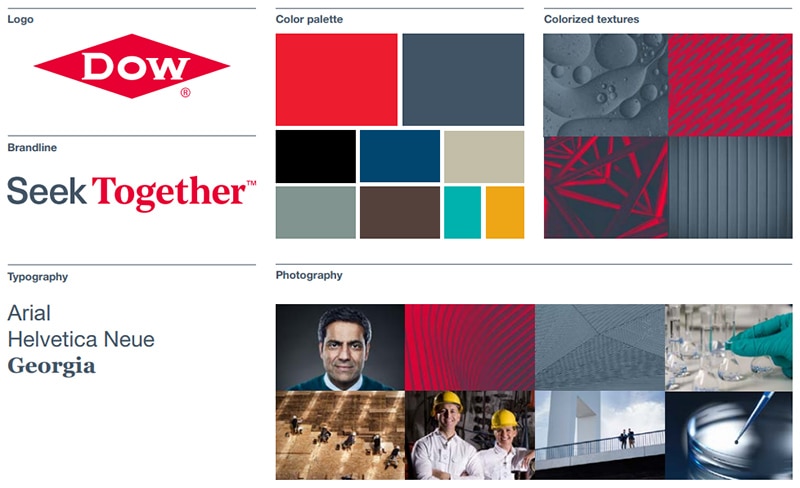
Our brand system brings together a group of elements that were developed specifically to support our brand ambition. Everything from the new brandline to the color palette and image styles all enhance our brand and elevate the DOW Diamond brand position.
View the brand guidelines (Visual identity toolkit section) for full details.

Our visual identity system is designed to support our company’s ambition:To become the most innovative, customer-centric, inclusive and sustainable materials science company in the world.
The key elements that support this ambition:
- Close collaboration to understand our customers’ objectives and challenges, and asking questions that lead to productive dialogue, stronger relationships and new answers.
- Our diverse and inclusive environment opens the door to fresh perspectives and original thinking.
- Harnessing digitalization and striving for sustainability, we constantly optimize the value we provide to our customers and society.
- When breakthrough innovations align with the reality of commercial application, they transform businesses.
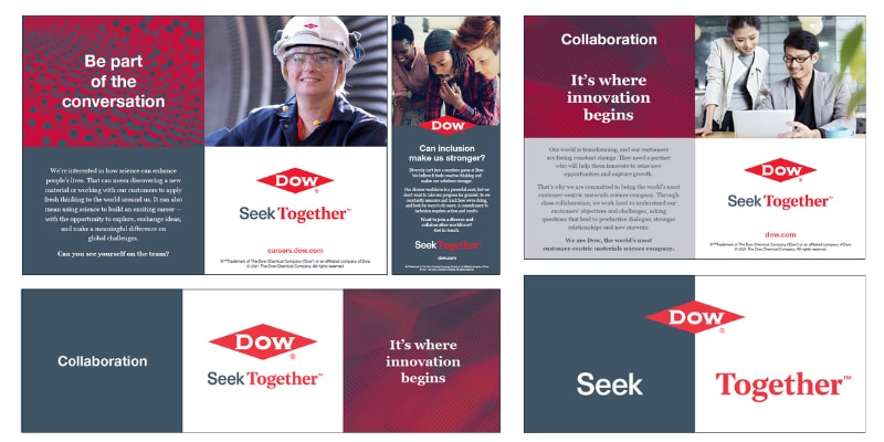
This brand system has been designed to have a back-and-forth "conversational" style with the use of our grid system, color, typography and considered placement of the DOW Diamond and brandline. When designing your communications, always be mindful of our commitment to collaboration and conversation. We also use our primary color palette to support, but not compete with the DOW Diamond.
Below are a few examples of how we can develop the “conversational” style in our communications. View the Dow brand guidelines section for more examples.

Dow employees, contractors and approved agency partners can access and download approved photos through the Dow Photo Library www.dowphotos.com. The library includes original Dow-owned photos and creative assets and licensed stock photography and video. All photos and video used for Dow purposes internally and externally should adhere to copyright and licensing laws.
All questions about photo access and usage can be directed to the Dow Creative Element Asset team at fgldcam@dow.com.
Dow Brand Portal
Securely find assets to help support a strong verbal and visual identity for Dow's brand.
Looking for Dow photography, video and other asset types?

Our team is here to support you
Feel free to contact the Brand Team if you have any questions, need assistance on projects or want feedback on brand usage.
